Think Endo
Think Endo is the first educational campaign of its kind, leading the way for front-line providers to recognize endometriosis symptoms earlier & improve care.
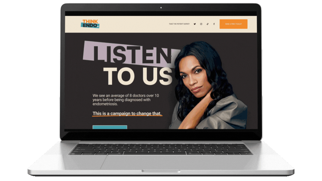
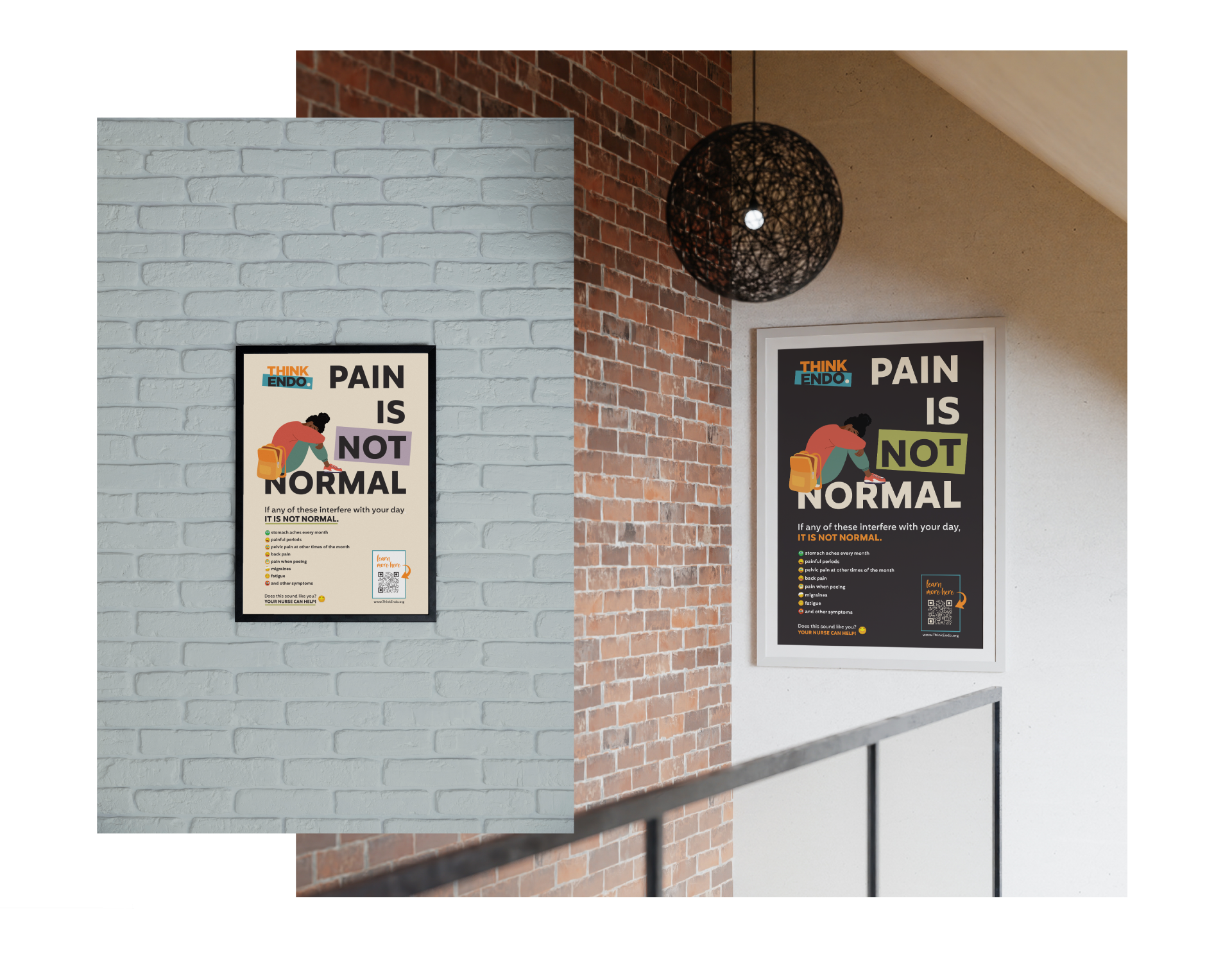
For this project, I created the complete logo and brand identity system and designed a wide range of digital and print assets, including the website, digital course materials, landing pages, flyers, educational one-sheets, and postcards.

Client Brief
Create a logo and cohesive brand identity for an educational health campaign designed to support frontline healthcare providers in recognizing and responding to endometriosis symptoms earlier and more effectively.
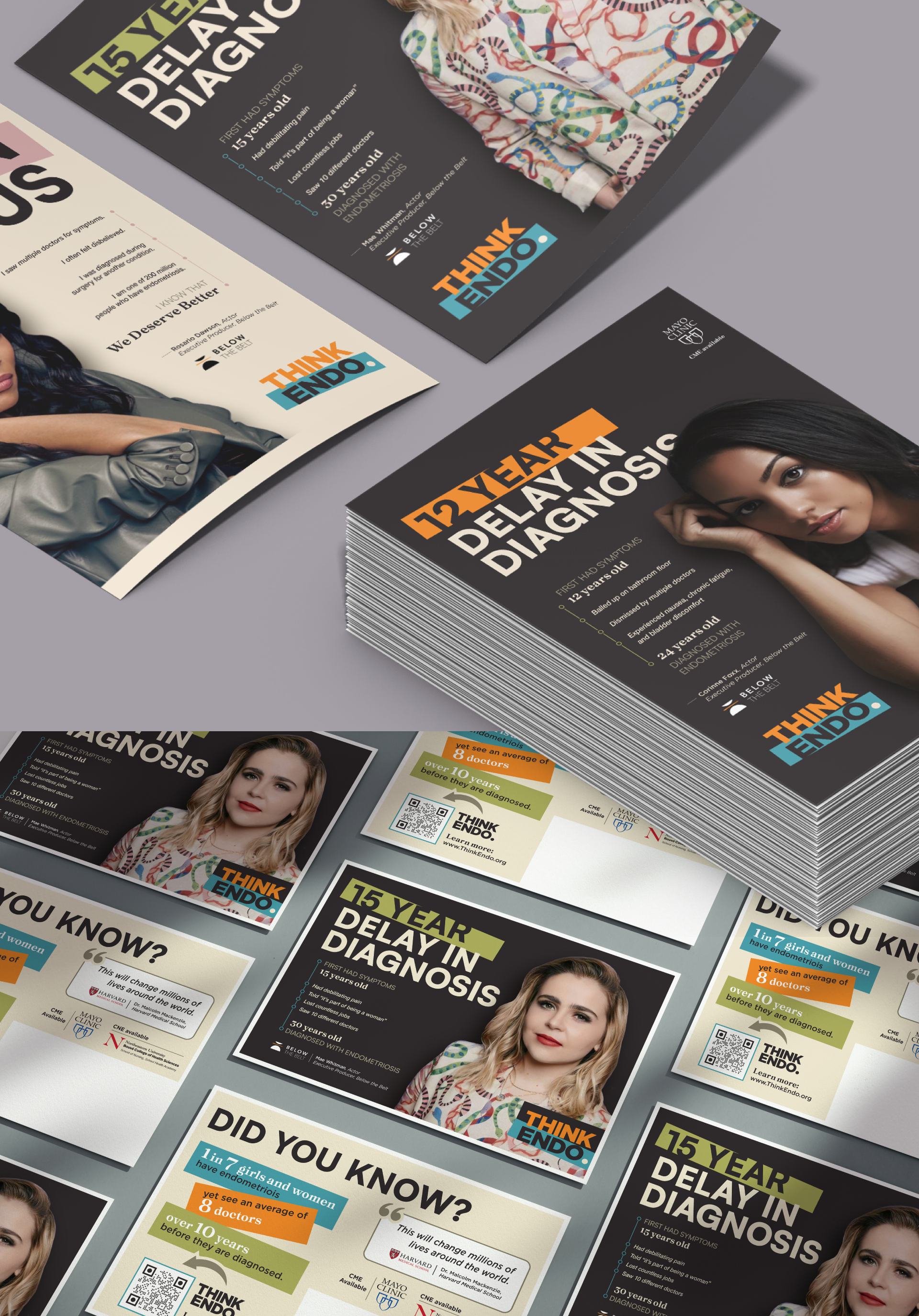
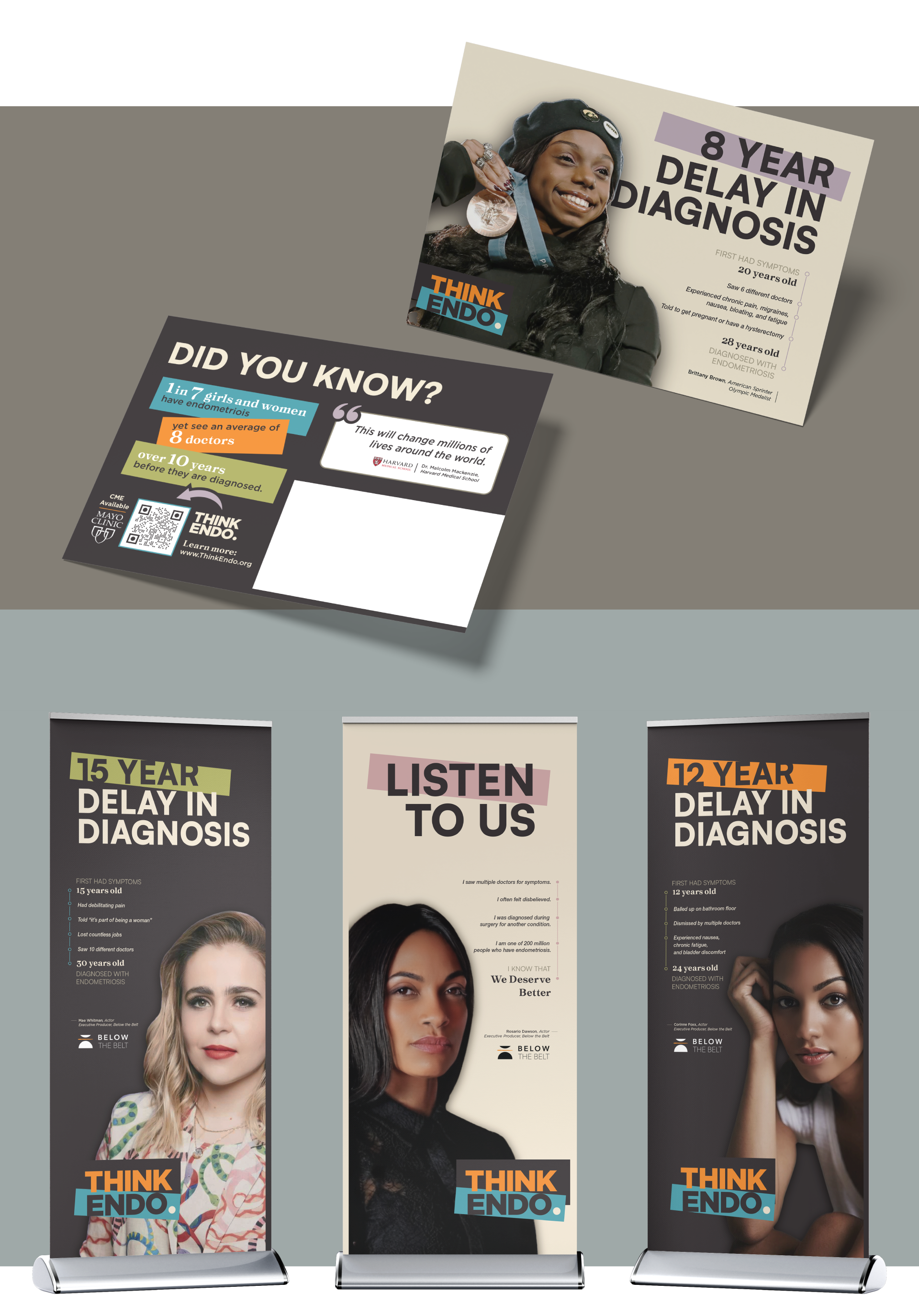
The work included designing a strong, memorable wordmark logo and visual identity (with a preference for stacked typography) along with supporting print materials such as one-page fact sheets for physicians and clinicians and 6×9 postcards.
Visually, the brand needed to align with the client’s existing advocacy work, incorporating the same signature orange used in the Below the Belt documentary branding (an endometriosis awareness film directed and produced by the client). The campaign was meant to feel warm, approachable, and authentic, avoiding overly clinical or sterile aesthetics while maintaining professional credibility.
The campaign also featured well-known advocates, including Rosario Dawson, Mae Whitman, Corinne Fox, and Brittany Brown. One approved photo of each advocate was provided to be incorporated into the branding.
The core goal of the campaign was simple and memorable: encourage providers to “Think Endo” when when presented with relatable or commonly dismissed symptoms that are often overlooked. The identity needed to be both emotionally resonant and highly memorable, helping to reinforce early recognition and improve patient outcomes.
Logo Evolution
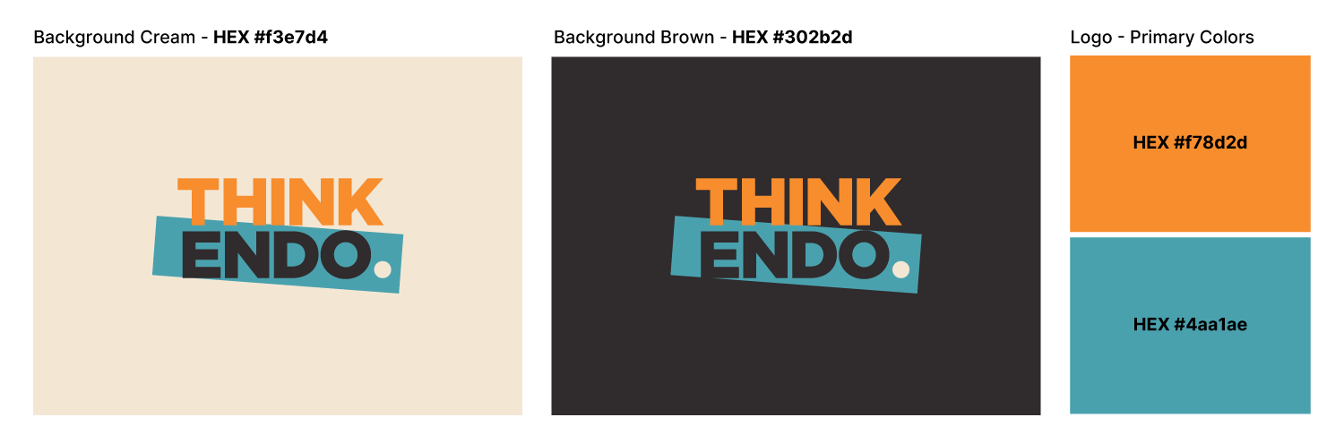
Early logo concepts explored the use of negative space and symbolic elements to introduce warmth, direction, and memorability. While these approaches added visual interest, the client ultimately preferred a more straightforward statement and the final logo landed on the same bold typeface with a period to emphasize “statement”, an angled slash to introduce movement/momentum and visual grounding, and the signature orange that needed to be incorporated to maintain continuity with the client’s broader advocacy work (while reinforcing visibility, urgency, and recognition).
Together, the elements result in a logo that is bold yet warm, memorable, and purpose-driven—designed to stand out, stick, and prompt action while also designed for versatility, maintaining clarity and impact on both light and dark backgrounds and supporting consistent recognition across diverse clinical and educational settings.
Visual Identity
The visual identity combines bold type, warm color, and clean layouts to create a system that feels clear, friendly, and easy to remember. The overall look was designed to feel human and approachable while reinforcing the campaign’s core message.
Deliverables